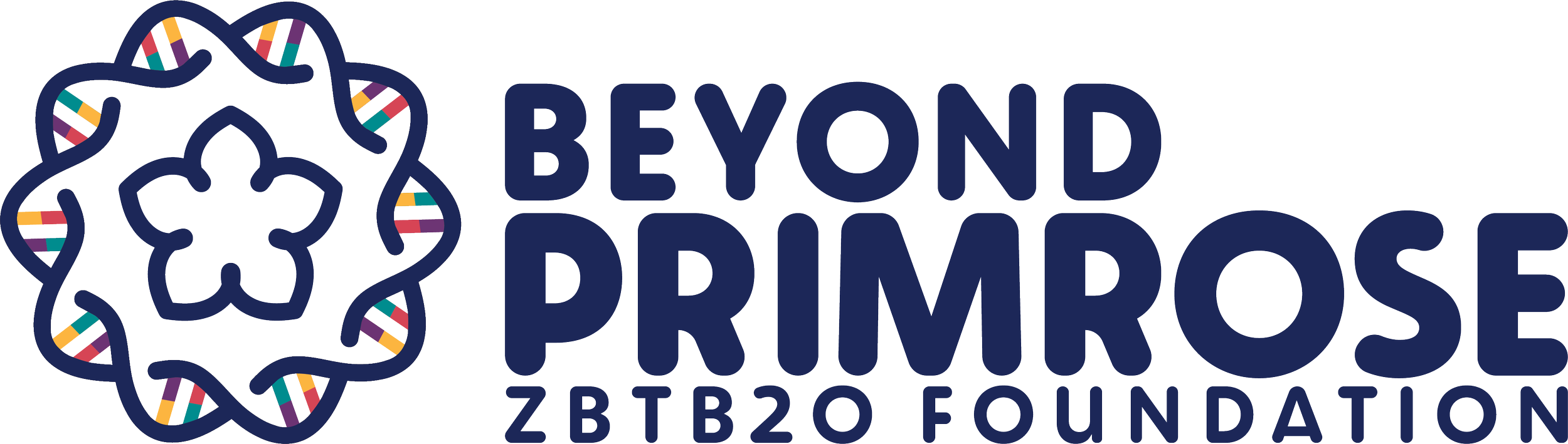
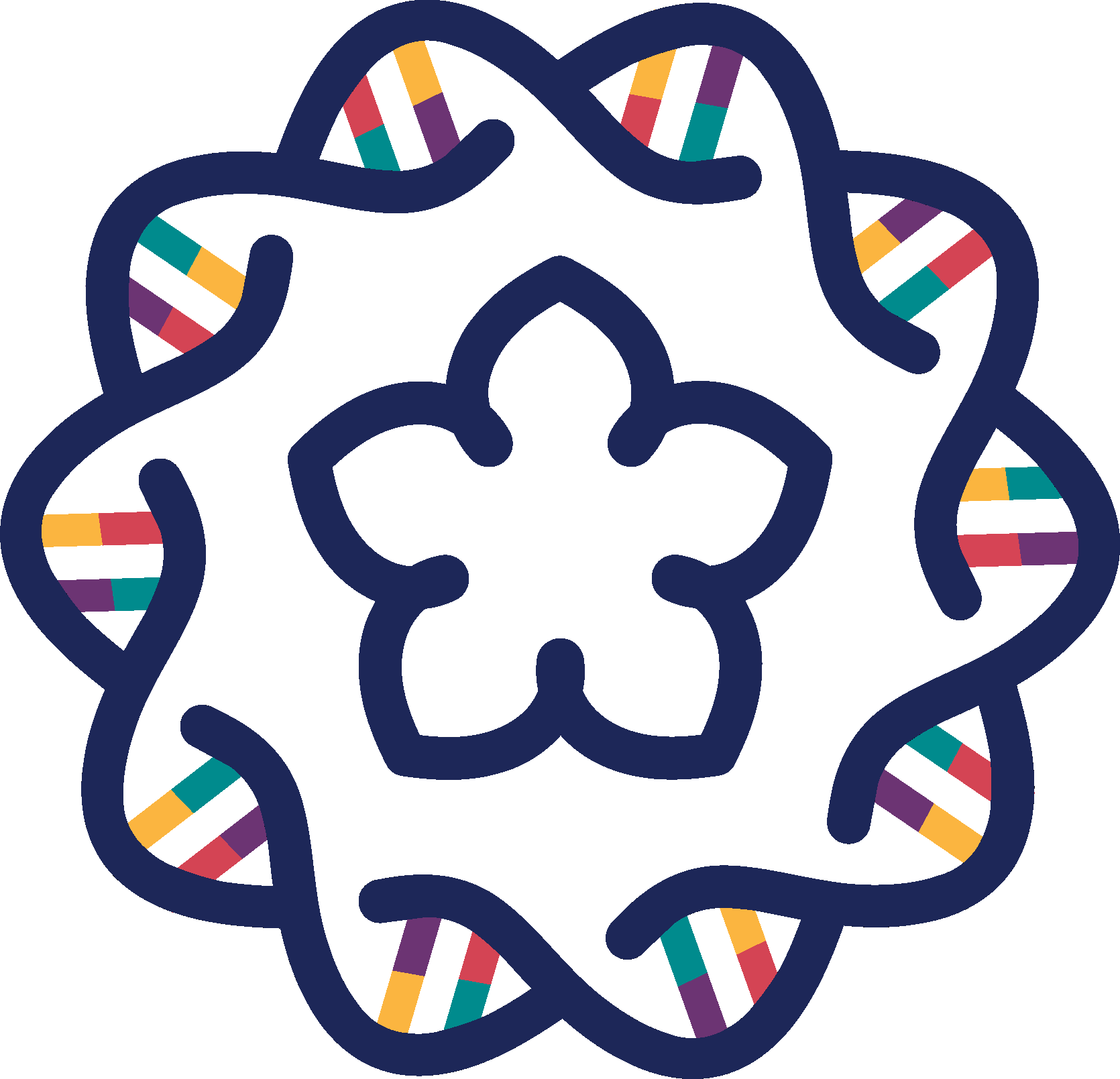
Featured ProjectsThe Co-Founder of the Beyond Primrose ZBTB20 Foundation came to me in the winter of 2025 and asked if I could help create a logo and brand identity for their new foundation. The organization funds research for Primrose Syndrome, a rare genetic disease that slowly progresses and can affect many body systems. They also aim to create a community of Primrose patients around the globe, and support those families. For their logo, they wanted something that included a primrose flower and the DNA double helix. I wanted a fun and colorful logo to bring a pediatric vibe, as the disease is generally diagnosed in childhood, but wanted to still maintain a scientific and professional feel.
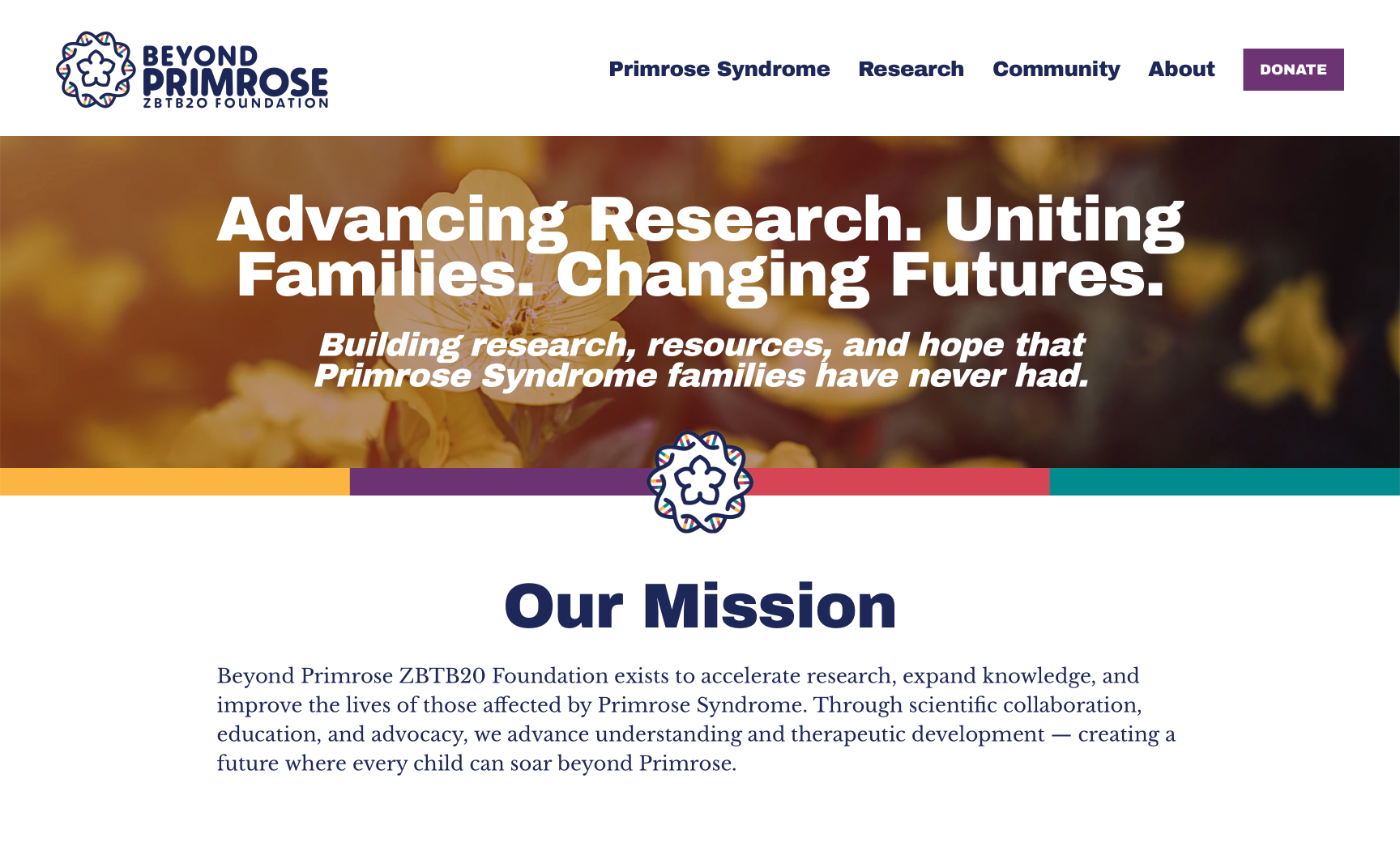
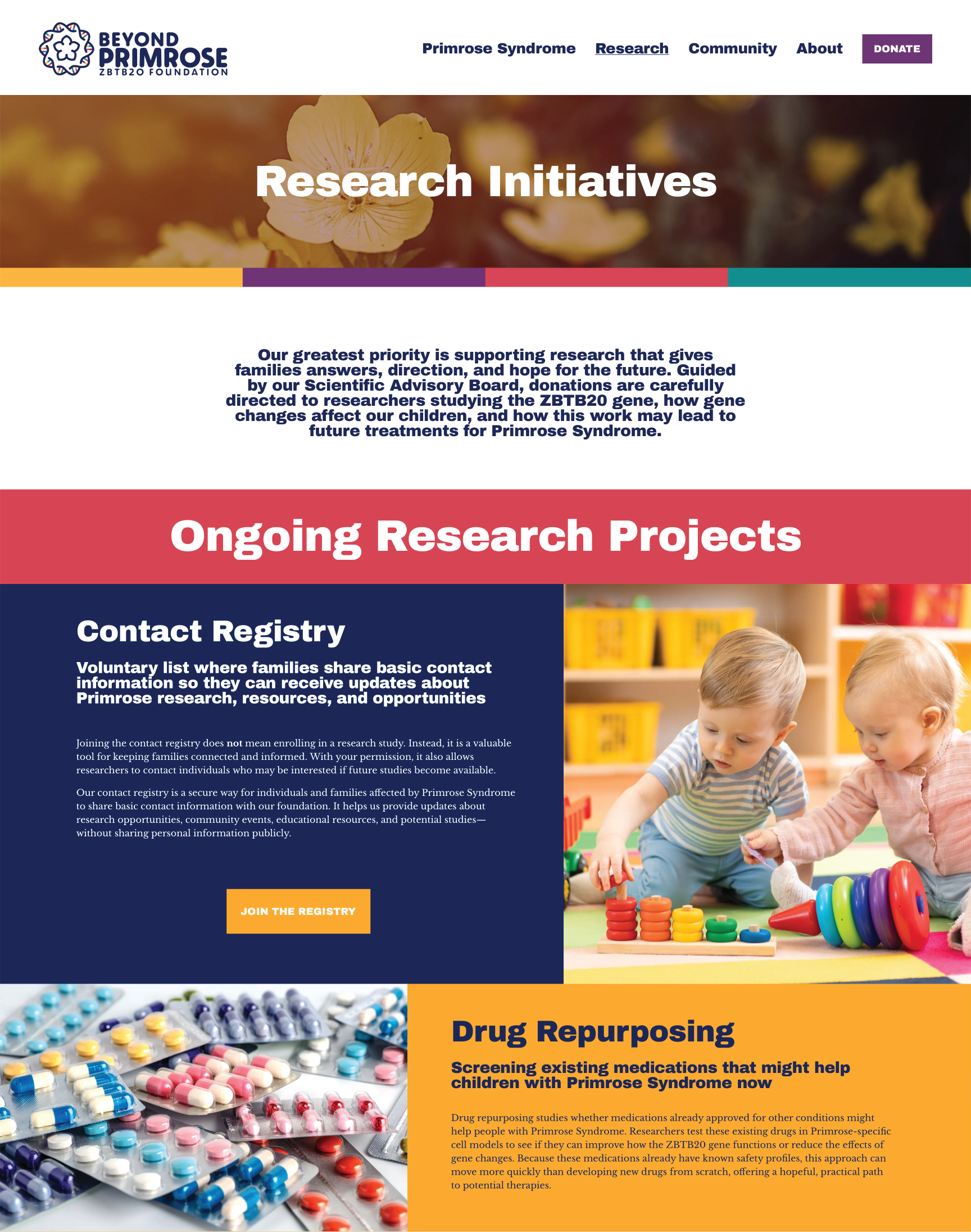
Website Design + BuildThe goal of the Primrose website was to communicate the organization’s mission and vision through its design, while being welcoming and hopeful. The colors from the logo create visual separation between initiatives, as well as a warm, kid-friendly feel. The sharp corners and straight lines elevate the design and underline the organization’s professionalism. Altogether, these elements create a friendly, professional visual system that reinforces brand identity and supports clear, empathetic communication.