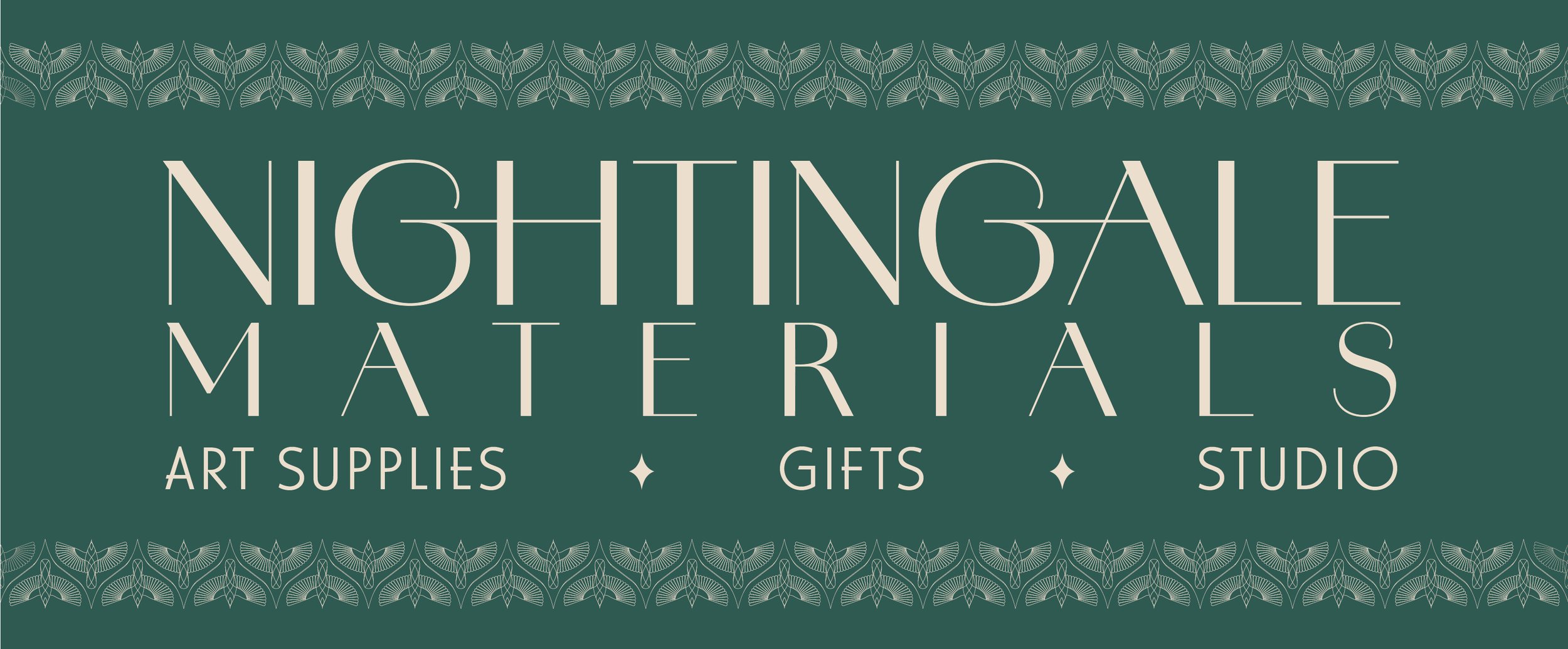
Logo & Branding ElementsWhen the owners of Nightingale Materials came to me with their nameless, logoless, brandless idea for an art store in downtown West Chester, I was instantly on board. We bounced around a bunch of name ideas, eventually deciding on Nightingale after a few ideas that just didn’t have the same ring. Nightingale felt right, and was a bonus because the word “night” holds special meaning for the family. With the name settled, we discussed what they wanted their brick-and-mortar store to look like. “Like a vintage apothecary, but with art supplies” was the consensus. With that, I ran to my computer and started curating color palettes that fit. The first color palette I created was the one we ultimately went with - a soothing emerald, soft cream text, and dusty lavender as an additional accent color. And next, the logo. They wanted an art-deco feel, so I created a few iterations of the logotype and bird. What resulted was a distinctive, simple (yet deceptively complex) art-deco-style bird and accompanying logotype that would look right at home in 1924 or 2024.


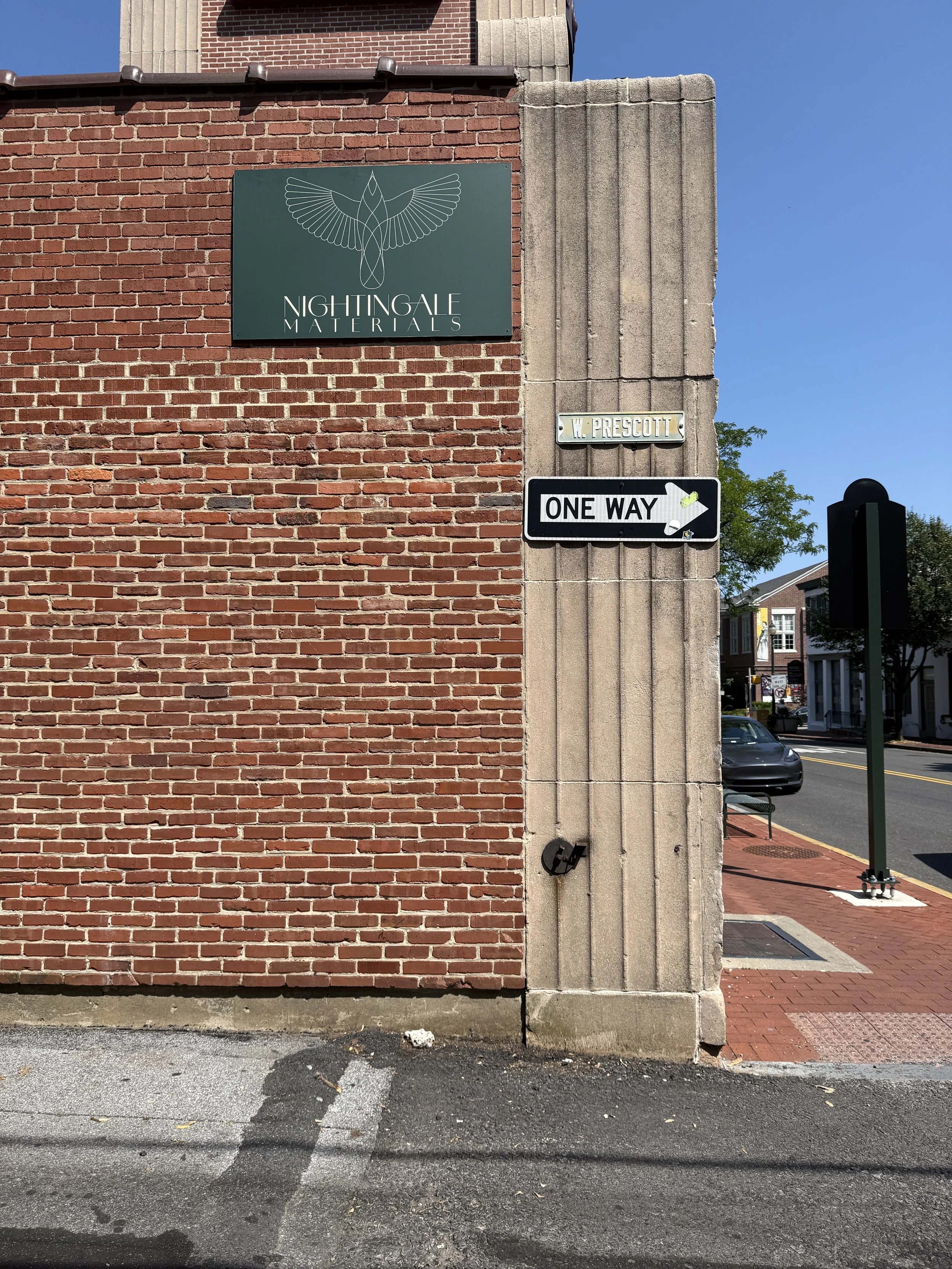
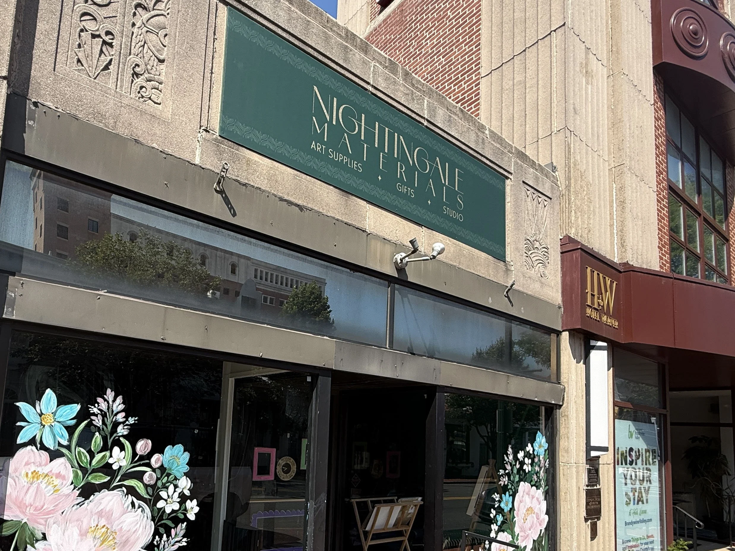
Building SignageWith the brand design complete and a lease secured, next up was a sign for the building. The building itself has art-deco architectural elements, lending itself perfectly to the Nightingale look. Because the art-deco vibes were already there, we didn’t need to add much detailing to the sign. I created a decorative stripe using the bird, which allowed us to keep with the symmetry of the building, incorporate the bird into the sign, and put the Nightingale name front and center, right above the door. We made use of the side of the building on the alley, too, with a small sign with the bird in the spotlight and the logotype beneath it.